Creating “that website about Git with cats”
TL;DR: I explain my process of creating the graphical style and illustrations for GitByBit. There's a time-lapse video at the end.
People keep asking me which AI model I use for creating GitByBit illustrations. These questions are somewhat infuriating amusing, considering that I create most, if not all, of the art with my sloppy hands. So I decided to write a bit about my illustration process and tools.
I'm not a pro artist. I am and always have been a developer at heart. And like most developers, I thought that I couldn't draw at all. Frankly, when I look at many of my paper sketches, I still don't understand how that can turn into something decent if you spend enough time developing it further.
I deeply believe basic drawing/design skills are SUPER useful for a software/web developer, especially if you plan on creating projects of your own. They let you express your ideas visually and make your products stand out.
I would argue that for many people who are looking for a dev job during these weird times, spending a month or two learning basic design skills is a much better investment than grinding through endless LeetCode problems (but not learning more Git, ha-ha). That's something that can make you stand out from the crowd and help you get noticed. That's something you can use in your own projects. That's something you can pivot to if you ever get tired of coding. And maybe, like it was for me, that's something you discover you enjoy doing.
Why illustrations?
When your job is to educate a human, illustrations are your best friends.
- A picture can explain some stuff better than a page of text.
- A clever visual metaphor can drill an abstract concept into your memory like nothing else.
- A comic strip can provide some mental relief when you're digging through tough, boring material.
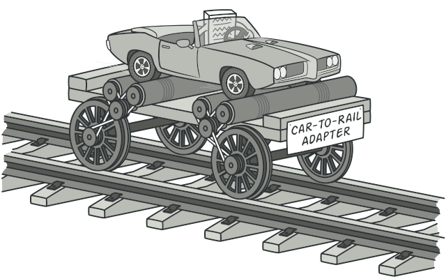
The Adapter design pattern.
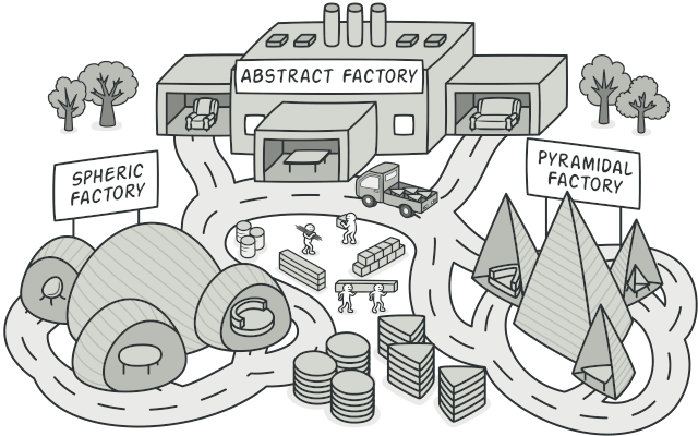
The Abstract Factory design pattern.
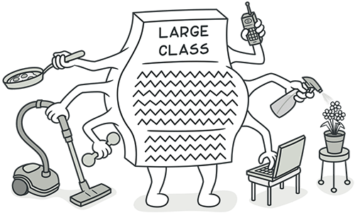
The Large Class code smell.
The logo
I try to think about the overall graphic style of a new project from day one. It's important to decide on the tone early, because you'll end up with a more consistent style and content at the finish line.
When I started working on GitByBit, I knew I needed an adorable mascot for the project. I friggin' love mascots. In fact, everyone loves them. A lot of people know me solely as that guy with the raccoon website, referring to Refactoring.Guru.
But I didn't have the slightest idea what kind of mascot would fit this particular project. A creature always associated with Git was the octopus. And while octopuses are fascinating creatures, it's pretty hard to draw an adorable octopus. I tried for a while, but then abandoned this approach.
It was only a few weeks into the project, and in parallel, I was working on the first draft of the content. The git init chapter had this little joke about a cat sleeping on keyboards while you were away.
My cat Steve used to mess with my work all the time when he was a little kitty.
That's when I had a revelation: cats are perfect! They are cute, they are funny, and they are known for their love of keyboards. Plus, there's a long-standing stereotype about programmers being cat lovers, a team of programmers being a herd of cats, and so on. This whole project being remembered as "git with cats" would be just perfect. It all clicked together nicely.
So this is how the first version of the project logo was created.
GitByBit logo v1.0
This was enough for a start, but I didn't have clear plans for the rest of the illustrations yet. At that point, I wasn't even sure that the whole project would take off. So I decided to focus on the core content first and worry about the rest later.
The visual style
Another breakthrough happened way later, almost a year into the project, in December 2024. By that time, the first version of the content was almost ready, so it felt that creating graphics was overdue. I still didn't have any clue about the overall visual style. Worse yet, after a year of working on the content, I was burned out creatively and the whole cats thing felt a bit stale.
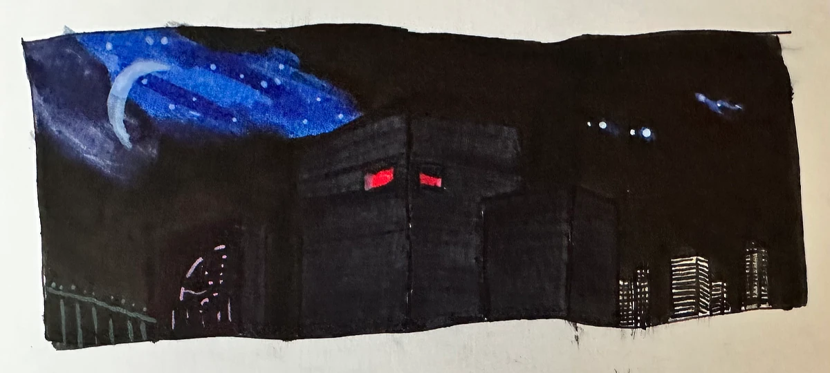
Nevertheless, during the Christmas break, I tried some rough ideas, which eventually led to the illustrations that can now be seen at the start of the course, the whole I messed up my project story (which is based on real events, btw).
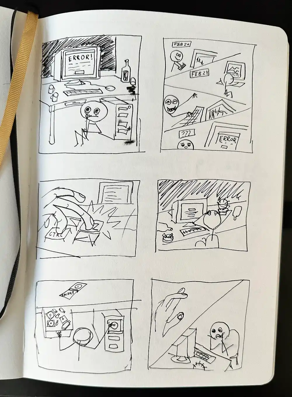
Sketches of the illustrations for the first chapter.
After converting it to vector and adding some basic interactivity on top, I ended up with the complete set of illustrations for the first chapter, which is very similar to what you can see in the course now.
The finished illustrations for the first chapter.
Cats everywhere
After finishing some more illustrations in the same style, I had a "this is it" moment. This style is playful, cute, and a bit silly, which is exactly what I wanted. It also fits the overall tone of the project perfectly. But there were no cats, which was a bummer. At some point, in frustration, I sketched a cat head over one of the existing illustrations and found that it was EXACTLY the look and feel I was looking for from the very beginning.

It's frustrating to backtrack and change all the completed illustrations, but it's part of creating a good, consistent result, and I think it all ended up looking amazing. People seem to love it too.
It's easy to fool yourself that you did a great job, but user feedback doesn't lie.
The process
Here's the time-lapse of me producing the Staging area illustration: 5 hours of real time in 5 minutes.
Step 1: Sketching
I used to sketch everything with pen and paper. Sketching on an iPad always felt odd, until I randomly tried the Paperlike screen protector. When applied to the iPad screen, it makes the surface feel a bit rough, so when you draw with the stylus, it feels like drawing on paper thanks to the added friction. I know this doesn't sound too convincing, but, holy cow, this was like drawing on a completely different device. Now, I mostly tend to sketch on the iPad, unless it's something super quick.
I had to take a few days' break in the middle, and in the process, my initial metaphor of software development is like building with LEGO, but mostly turds 💩 evolved a bit to connect with the other completed illustrations (Git, git pull, git push).
Step 2: Vectorizing
After the sketch is ready, I take it to my desktop computer and start vectorizing it in Affinity Designer. Here everything starts to look more polished and colorful.
Step 3: Adding parallax effect
Before I export the vector file to SVG, I select a few layers and give them special names, which will be rendered as CSS class names in the exported SVG file. I will be able to access these layers later in the code to add some parallax effect when the user moves the mouse around.
* * *
I hope you've found this little peek into my illustration process entertaining. If you have any questions or want to share your own experiences with creating illustrations, feel free to drop me a line at alex@gitbybit.com.
I'm still going to announce this properly in the next post, but GitByBit left Early Access last week and (finally) became a proper product. The main course remains free, but the focused practices are now part of the paid add-on, the GitByBit PRO.
If you'd like to support my further work, consider purchasing a copy for yourself or someone you love. The PRO version is a one-time payment and it's priced fairly. You can even enjoy a neat Christmas holiday discount during the next few weeks.